A friend of mine recently decided to get back into the e-commerce game, and he asked me for help picking the right platform and tools to launch his store. Easy enough, right? Well, as I dove into the world of e-commerce solutions, I noticed something interesting: almost every platform and their related apps had a special “Comparison Page” — you know, “Solution A vs. Solution B” type of thing.

Each one seemed set on proving why they were the absolute best, with tables, icons, bolded checkmarks, and a dash of self-promotion for good measure.
But this got me thinking: in the industry I work in — conversational AI services — comparison pages are practically a rarity. Why don’t more companies in this space use them? Are they not worth the effort, or is there something uniquely tricky about them?So, what’s the real impact of these pages? Do they help customers make better decisions along their B2B buying process, or are they just another chance for companies to sing their own praises? And, more importantly, what’s in it for the SaaS companies that create them?
What are SaaS comparison pages, anyway?
I think you already know what I’m talking about. If you’re in marketing for a few years, you’ve certainly already had to buy a professional solution online (Semrush for your SEO, some apps for your WordPress or Shopify website…).
Comparison pages are those nifty little sections on SaaS websites where Company A lines itself up against Company B (and sometimes C or D, for good measure) and tells you exactly why it’s the best choice. Think of them as the virtual “pros and cons” list — only here, the pros are all on one side:
These pages are like a guided tour through the best features, perks, and competitive edges a product has. They’re structured to help you see exactly where one solution might outshine another: maybe it’s got a slicker design, maybe it’s cheaper, or maybe it’s just the “fan favorite” for businesses of a certain size.
Often you’ll find a side-by-side table with categories like “Features,” “Pricing,” “Support Options,” and “Customer Satisfaction.” It’s all laid out in a way that’s supposed to make your choice feel clear as day.
Now, here’s where it gets interesting. Unlike the classic product pages or FAQs, comparison pages don’t just focus on the product itself. They put the spotlight directly on the competition — and this is both their genius and their risk. You’re not only introducing potential customers to your strengths; you’re reminding them that there are other options out there.
So, what’s the real purpose? The idea is simple: by giving customers a structured way to compare, you’re helping them move down the decision path faster, hopefully right into your product’s arms. But as we’ll see, there’s a lot more to it than that, and it’s not always a smooth ride.
Benefits of comparison pages (or, why bother?)
Alright, so why go through the hassle of putting your competition right on your website?
Well, turns out, there are some pretty solid reasons for SaaS companies to roll out comparison pages. Let’s dig into the perks:
- Helping customers make sense of the options
Picture this: your potential customer is drowning in choices. They’ve got tabs open, they’re comparing features, trying to make sense of what’s actually worth their money. A good comparison page cuts through all that noise. By showing a clear side-by-side layout, you’re giving them an easier way to make their decision, and hopefully, you’re nudging them in your direction. - Controlling the story
Think of it this way: if people are already looking up comparisons, why not be the one to guide the narrative? By creating the page yourself, you get to spotlight your strengths. It’s like having the mic at a karaoke bar – you’re the one setting the tone, making sure your unique features shine, and telling your side of the story first. - The soft sell
Here’s the beauty of it: comparison pages aren’t the hard sell. You’re not screaming “Buy now!” at people. Instead, you’re setting up a helpful, objective-feeling guide that lets them draw their own conclusions. And if you play your cards right, your product stands out as the obvious choice – all without pushing too hard. - Hello, SEO
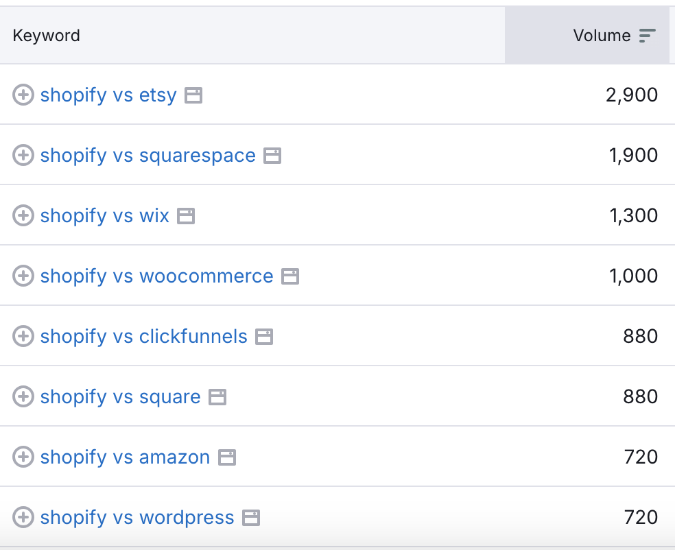
Comparison pages are an SEO jackpot. People are out there Googling things like “Best CRM for small businesses” or “Solution A vs. Solution B,” and if you’ve got those exact keywords on your site, guess who’s more likely to show up? Exactly. Done right, a comparison page can help bring in those lovely high-intent visitors – the ones who are already weighing their options and just need that final nudge.
Of course, like all good things, there are some catches. For every SEO boost and controlled narrative, there’s a flip side we’ll get into in the next section. But when used well, comparison pages can be a helpful tool for both you and your customers.
Drawbacks of comparison pages (the not-so-great stuff)
Comparison pages sound like a no-brainer, right? Well, not so fast. While they can be useful, they come with a few quirks that can backfire if you’re not careful. Here’s where things can go sideways:
- Risk of looking too pushy
Picture this: you’re reading a comparison page, and everything about the competitor feels like it’s in fine print. Your eyes glaze over, and you start wondering, Are they trying too hard to sell me? That’s the risk. If you overdo it – highlighting every single flaw of the competition – it can come off as desperate or biased, and it makes customers question if you’re playing fair. - The free marketing you didn’t mean to give
Yep, you might accidentally promote your competitors. By naming and describing them, you’re validating them as real alternatives. Suddenly, a potential customer who didn’t know about Solution B before is now curious. Even if you’re showing off your strengths, there’s always that chance a prospect thinks, Actually, let me take a closer look at this other one… - Constant upkeep
One thing about the SaaS world – it moves fast. Prices change, features update, new integrations pop up. And if you’re maintaining a comparison page, you’ve got to keep up with all that. Let it slip, and you’re suddenly the one with outdated info, which doesn’t just make you look sloppy; it can mess with your credibility. Updating comparison pages can quickly turn into a full-time job you never signed up for. - Encouraging head-to-head shopping
When you lay everything out side-by-side, you’re encouraging that head-to-head mindset, which can sometimes work against you. Prospects start to see you as just another option in a lineup. In some cases, it might draw attention to areas where you’re not as strong or where a competitor does have a real advantage. Instead of standing out, you end up reinforcing that you’re one of many.
So, yeah, comparison pages can be handy, but they’re not always smooth sailing. Done right, they can boost your credibility and draw in customers ready to choose. Done wrong? Well, you could end up giving your competition a little too much free PR or setting yourself up for some never-ending page updates. Like anything in marketing, it’s about finding that balance.
When comparison pages make sense
So, when’s the right time to put in the effort for a comparison page? Because, let’s be honest, they’re not always worth it. Here’s a quick guide to when these pages can make you look like a rockstar – and when they might just be a headache in disguise.
When they work wonders:
- Crowded markets with look-alike products
If you’re in a market where products are so similar you could swap them like identical twins, comparison pages are your friend. Think about CRMs, project management tools, or email marketing platforms – there are loads of them out there, and prospects want help picking. By showing how you stack up, you’re helping people make sense of it all and steering them in your direction. - When your product has a clear, standout advantage
If there’s one thing you do way better than everyone else, then, by all means, shout it from the rooftops! Comparison pages let you highlight that “it” factor – maybe it’s a unique feature, unbeatable support, or value-packed pricing. Whatever makes you different, put it front and center, and let customers see why they’d be missing out if they went elsewhere. - For established competitors people already know
If everyone’s already talking about the same top 3 or 4 competitors, adding a comparison page won’t introduce anything “new.” It just helps you show why you’re a better choice within a well-known set of options. Think of it like giving your product a spotlight in an already crowded theater.
When they can backfire:
- Niche markets where you’re the new kid on the block
If you’re in a niche where your company or product is still finding its place, comparison pages can feel a bit forced. You don’t want to come off as “punching up” by trying to measure yourself against established giants just yet. Sometimes, it’s better to build credibility in other ways first and let your product’s reputation grow naturally. - When your features are still in development
If your product is still adding new features or testing its core offerings, comparison pages are a bit of a gamble. You don’t want to advertise features that aren’t fully baked – it just sets you up for extra maintenance and risks disappointing customers if they arrive expecting bells and whistles that are more like “coming soon.” - Emerging or rapidly evolving industries
Take conversational AI, for example (a field I know pretty well!). In industries that are still defining themselves, comparison pages can create more questions than answers. These markets are changing fast, and competitors may not be as clearly defined, so trying to put everyone in neat boxes might just confuse prospects.
In the end, it’s all about balance. Comparison pages are just one ingredient in the bigger SaaS marketing recipe. So, if you decide to dive in, make sure you know why you’re doing it, keep it authentic, and remember: sometimes less is more.
Comments