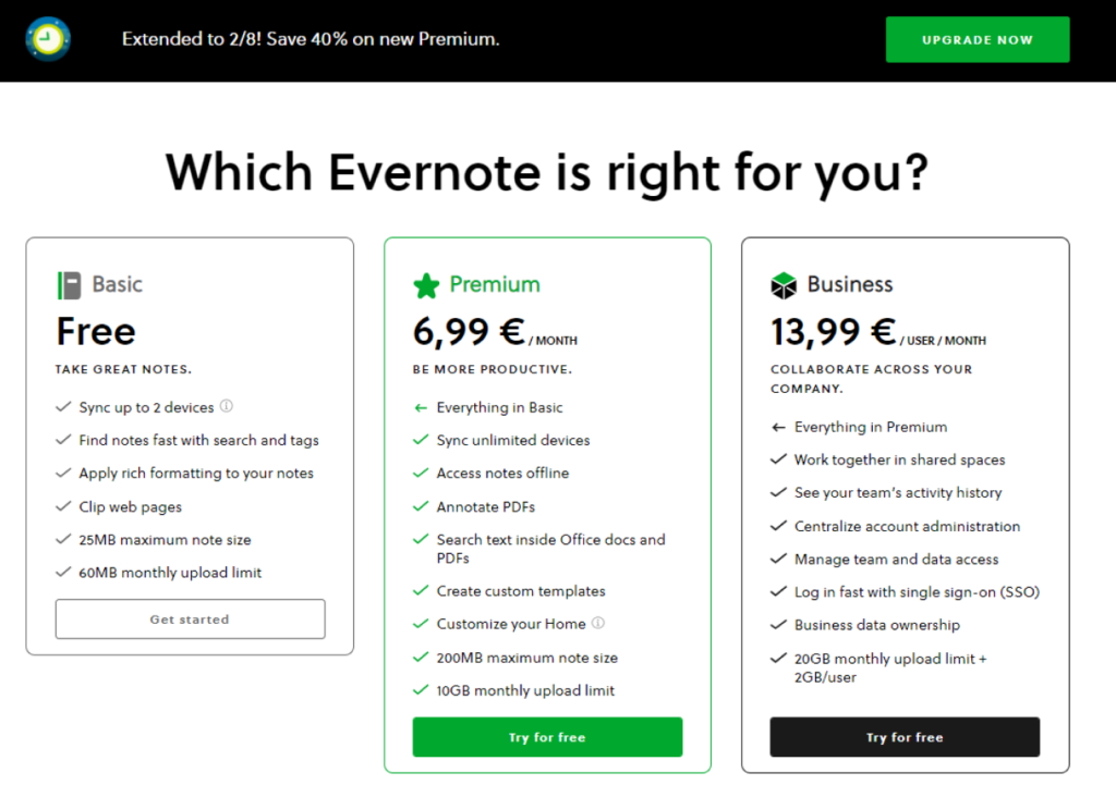
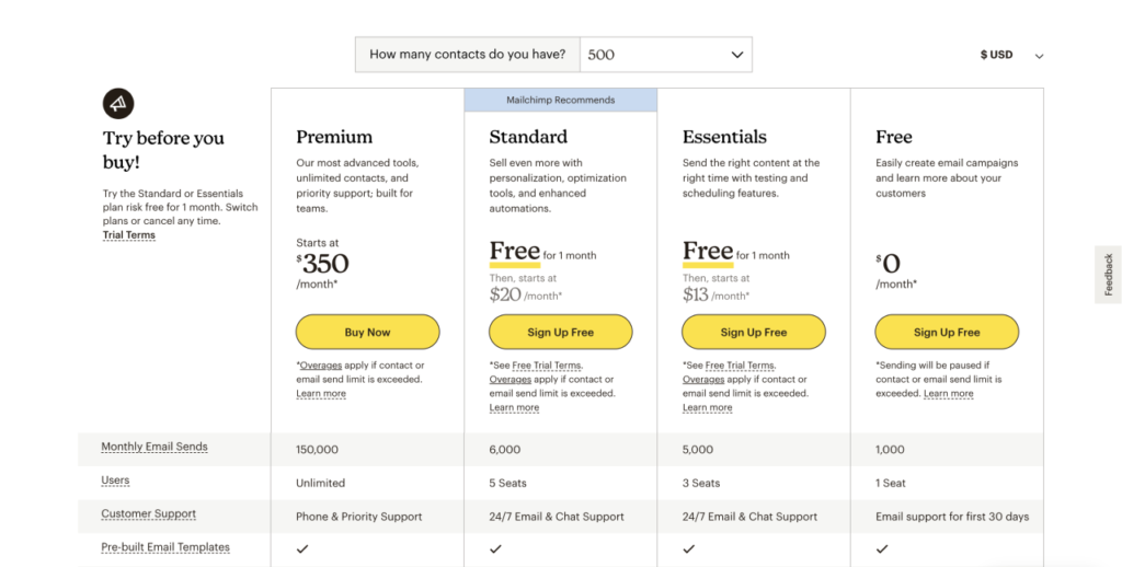
I’ve known about the Von Restorff effect for a long time—since back in my marketing studies, to be precise. It’s one of those things everyone already understands without actually knowing it has a fancy name. Like, have you ever noticed how on almost every SaaS pricing page, there’s always that one plan that just screams:

That’s the Von Restorff effect at work, my friend.
And we see it everywhere, especially in pricing pages where one option just pops. It’s funny how something so widely used is kind of hidden in plain sight.
Let’s break down how this effect works, so next time you’re building a landing page, you can make sure your offer doesn’t just blend into the crowd.
What is the Von Restorff effect?
The Von Restorff Effect is named after Hedwig von Restorff, a German psychologist who discovered this phenomenon in 1933. During her research, she found that when people are presented with a series of similar items, the one that stands out is more likely to be remembered.

In simple terms, the Von Restorff Effect is all about how our brains are wired to notice what stands out from the crowd. If something looks different or is isolated from the rest, it instantly grabs your attention and becomes more memorable.
Here’s an easy example: imagine you’re scrolling through a long list of grey subscription plans, and suddenly—bam!—one of them is highlighted in bright green with a “Most Popular” tag. Your eyes naturally gravitate toward that one, and your brain takes note. That’s the Von Restorff Effect in action, isolating something visually to make sure it’s noticed.
Why does this happen? Our brains love shortcuts, and they’re constantly searching for ways to process information quickly. When something breaks the pattern or looks unique, our brain flags it as more important or interesting, making it stand out more in our memory.

How does it work in marketing?
It’s everywhere—especially on those lovely SaaS pricing pages. Ever noticed how one plan in a pricing grid always stands out with a bright color or a bold “Recommended” tag? That’s no accident. Marketers are masters at using this effect to guide your attention toward the option they want you to choose.

Here’s a personal example: I’ve seen up to +262% more conversions by breaking the comparison between two pricing plans I had with the creation of a third, completely overpriced plan. This third plan wasn’t meant to be chosen at all—it was purely there to make the mid-tier option, the one I wanted to sell the most, look like an amazing deal in comparison. And guess what? It worked. People naturally gravitated toward the middle option because the overpriced plan made it seem like a no-brainer.
This tactic combines two psychological tricks:
- Visual Difference: The key plan stands out visually through color, size, or tags, catching your attention.
- Perceived Value: By adding an overpriced plan, it creates a strong sense of value in the option you want customers to pick, making it seem like a great deal.
It simplifies decision-making for the buyer, nudging them toward the option that feels “just right.”
So, whether you’re building out a new pricing page for your SaaS company, designing product packaging, or even crafting a promotional offer, don’t let your key messages fade into the background. Make them pop!
The Von Restorff Effect is a great little tool to have in your marketing kit because it plays directly into human psychology. It’s about making your product or service stand out in a world full of grey.
The best part? Everyone’s already using it—even if they don’t know it by name.

Comments